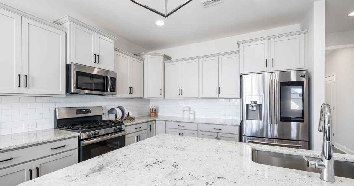
Kitchen countertops carry a strange design burden. They have to work as prep surfaces, catch mail, hold coffee, and somehow still look styled when someone walks in. Most kitchens miss the last part not because of the appliances or the tile, but because of what sits on the counter itself. That stand mixer that lives out because the cabinet won’t take it. A paper towel roll parked on the corner. Three half-used spice jars nobody put away.
Good kitchen countertop decor ideas start with a rule most people skip: nothing goes on the counter unless it earns the space. Style comes from editing, grouping, and picking two or three anchor pieces that do the visual heavy lifting. This piece walks through ten fixes that work in real kitchens, with the sizing, materials, and placement details that separate an intentional counter from a cluttered one. The last fix is the one most kitchens still get wrong.
Key takeaways:
- Style comes from editing, not adding. A cluttered counter reads busy no matter how nice each piece is on its own.
- The 3-Zone Countertop Method (Prep, Feature, Service) keeps working areas clear and styled areas intentional.
- One 14 to 18 inch wooden board anchors a counter run better than three small ceramic pieces.
- Warm 2700K under-cabinet lighting shifts how a kitchen reads more than any single decor piece.
- Cluster in odd numbers, vary heights by at least three inches, and leave 60% of every zone as breathing room.
- Match decor pieces to counter length, not to what looked good in someone else’s kitchen photo.
What makes a styled kitchen counter actually work
A styled kitchen counter works when it does three jobs at once: leaves enough clear space to cook, groups a few pieces intentionally, and pulls warmth into a room that’s mostly hard surfaces. Get any of the three wrong and the counter reads either cluttered or sterile. Nothing in between.
Countertop styling borrows most of its logic from broader home decor ideas around shelving and console tables. Grouping, height variance, breathing room, one anchor piece. What kitchens add is a strict functional rule: prep zones stay bare. That part isn’t negotiable. A styled counter that blocks the space where a cutting board lands is a failure, no matter how good it looks in a photo.
The other thing kitchens do differently is texture. Most kitchen surfaces are hard and cool. Quartz, tile, stainless, glass, painted cabinetry. Decor pieces work by adding what’s missing, which usually means warmth, softness, and organic shape. A walnut board next to a marble counter reads styled because it’s a texture the room otherwise doesn’t have. A trailing plant works for the same reason. Cool ceramic against cool stone rarely does much.
Pro tip: Before adding anything to a counter, list the room’s dominant textures. If everything’s cool and hard, decor pieces should be warm and organic. If cabinetry is already warm wood, matte ceramic or dark metal usually reads better than more wood on top.
10 kitchen countertop decor ideas that work in real kitchens
Each fix below covers one usable pattern. They stack. Most kitchens need three or four, not all ten. Pick the ones that match your counter length, cabinet color, and how much you actually cook.
1. Anchor the run with one large wooden board
Every styled counter needs one anchor piece that carries the visual weight. A wooden serving or cutting board sized between 14 and 18 inches long does this better than almost anything else. It reads as functional, adds warmth to cool stone or quartz, and takes up a legitimate footprint without eating prep space.
Lean the board against the backsplash if the counter is deep enough, or lay it flat as the base for a small cluster (a crock and a bowl sitting on top of it, for example). Walnut, oak, and end-grain maple all photograph well and hold up to real use. Skip the thin bamboo boards, they read cheap even when they aren’t.
If a kitchen already runs heavy on warm cabinets like pine or hickory, choose a darker board (walnut or smoked oak) so it stands apart. Cabinets in painted white or cool grey pair well with any warm wood. FlashyKitchen’s guide to pine kitchen cabinets covers the wood-tone pairing logic in more depth.
2. Add one ceramic utensil crock as functional decor
A utensil crock hits the sweet spot of decor: it looks intentional, gets used every day, and clears a drawer of wooden spoons that never fit right. Size matters. Aim for a 6 to 7 inch tall vessel with roughly 4 to 5 inch diameter. Anything smaller reads dinky, anything larger takes over the corner.
Matte glazes read more considered than glossy ones. Neutral tones (bone, warm white, terracotta, deep charcoal) age better than trendy colors that date fast. Stoneware or hand-thrown ceramic has more visual weight than machine-perfect porcelain, which matters on a kitchen counter where nothing else looks factory-finished.
Fill it with wooden spoons, one whisk, a slotted spatula, and maybe a pair of long tongs. Five to seven pieces total. Overstuffing turns the crock into a mess that reads busy from across the room. Under-filling reads incomplete.
Place it in the corner nearest the stove, not in the middle of prep space. It works with the cooking, not against it.
3. Style a shallow fruit bowl as an intentional cluster
A fruit bowl works as decor when it’s shallow, matte, and holds one or two fruits at a time, not a hardware-store bin of everything you own. Best size: 10 to 12 inches across, no more than 3 to 4 inches tall. Anything deeper hides the fruit and speeds up rotting.
Stone (marble, travertine), matte ceramic, or hammered brass all read considered. Woven baskets can work in farmhouse-style kitchens but tend to trap dust and moisture that shortens fruit life. Skip glass. Clean glass shows every fingerprint and cloudy glass just looks tired.
Fill with what’s actually in season and eaten within four days: three lemons and two limes, a small pile of stone fruit, or half a dozen apples of a single variety. Mixing every color on the shelf turns the bowl into a still life that reads staged and overworked. A monochrome pile of five to seven pieces of one fruit reads intentional.
Position it toward the counter’s feature end, away from the sink and prep triangle where hands land constantly.
4. Set up a coffee or tea corner as one zone
A coffee corner works as decor when it’s grouped tight enough to read as one intentional cluster instead of scattered appliances. Assign a single 24 to 30 inch stretch of counter to it, ideally under a wall cabinet you can dedicate to mugs, beans, and filters.
Anchor with the largest piece (usually the espresso machine or drip coffee maker). Build outward: a wooden bean canister, a small ceramic tray for spoons and sugar, one clear glass jar of coffee beans if the roast color adds contrast. Six items maximum, arranged in two loose height tiers.
The trick most people miss: put a small mat or wooden tray under everything. A 12 by 18 inch runner in linen, wood, or leather immediately frames the zone as intentional. Without that base layer, the pieces read scattered even when they’re grouped tight.
Keep the electric kettle here if it’s a daily-use item, but route the cord flat against the backsplash. Visible cords cheapen the whole cluster faster than any single item.
5. Add one trailing plant or low herb pot
Plants do work in kitchens that nothing else can. They break the geometry of a mostly rectangular room, add movement, and pull green (a color otherwise absent) into a palette of white, wood, and stone. But most people either buy the wrong plant or place it in the wrong spot.
For counters, pick trailing pothos, string of pearls, or a small mounded herb like basil, thyme, or oregano. Skip fiddle-leaf figs and monsteras (too big), succulents (too fussy about light), and orchids (they die in kitchen humidity swings).
Container matters as much as the plant. A 5 to 7 inch terracotta pot, unglazed matte ceramic in a warm tone, or hammered metal reads considered. Painted plastic reads like a rental fix. Group the pot on top of a wooden board or ceramic saucer to protect the counter from moisture rings.
Place it in the corner farthest from the stove and closest to a window. Kitchens without windows still work if you rotate two plants every two weeks between the counter and a brighter room in the house.
6. Cover corner appliances with a bread box or fabric cover
Small appliances kill counter styling faster than almost anything. The toaster with breadcrumbs around it. The air fryer sitting at odd angles. The stand mixer that never quite gets put away. If cabinet space won’t fit them, the fix is coverage, not concealment.
A wooden or metal bread box (15 to 17 inches wide, 8 to 10 inches tall) hides the toaster and doubles as bread storage. Look for roll-top or flat-hinged lids in walnut, matte black steel, or unpainted metal. Fabric appliance covers work for stand mixers and food processors: canvas, waxed cotton, or heavyweight linen in neutral tones.
The visual logic is simple. Covered appliances become one clean form instead of six competing shapes. A single walnut bread box on the counter reads styled. Three exposed small appliances read cluttered no matter how new or expensive they are.
Batch cook and cover afterward. The mixer stays out because it gets used three times a week. It just doesn’t have to look like a mixer when it isn’t working.
7. Style the backsplash-adjacent shallow ledge
Many kitchens have a 3 to 5 inch shelf behind the sink or along the backsplash. Most people leave it empty or stack sponges and dish soap there. Both waste it. That ledge is prime styling real estate because it lifts small decor above prep zones without eating counter footprint.
Use it for two or three low-profile pieces: a small ceramic vase with a single stem, a squat brass measuring cup, a folded linen tea towel, a low candle in a hurricane glass. Keep everything under 8 inches tall so it doesn’t crowd the backsplash tile or hood.
The rule: whatever goes on the ledge either serves the sink area or reads as art. Dish soap in an amber glass dispenser qualifies as both. A random spice jar does not.
If a kitchen doesn’t have a built-in ledge, add a 24 inch narrow floating shelf 14 to 16 inches above the counter. It costs under $40 and instantly gives the room a display surface that doesn’t compete with cooking.
8. Layer under-cabinet lighting at 2700K warm white
No single decor piece does more for a kitchen’s evening feel than warm under-cabinet lighting. Overhead ceiling lights (usually 3000K or higher) flatten a kitchen after dark. Under-cabinet strips at 2700K throw a low, warm wash across the counter that makes even a plain quartz slab look styled.
Pick continuous LED strips over puck lights. They read cleaner and hide better under the cabinet lip. Adhesive strips run $30 to $80 for a full kitchen with no wiring required. Warm-white color temperature (2700K) is non-negotiable here. Cooler temperatures (3500K and up) make food look grey and cabinetry look plastic.
Aim the strip forward, not straight down. Angled 30 to 45 degrees off the backsplash, the light spreads across the counter surface and up the tile. That’s the trick most staged photos use to make counters glow at night.
If under-cabinet lighting isn’t possible (open shelving instead of upper cabinets), add a small warm-toned lamp on the far end of the counter. A 15 inch table lamp with a linen shade at 2700K covers most of what a light strip would.
9. Add a small marble or wooden tray to corral loose items
Every kitchen accumulates small items that don’t have a natural home: salt cellar, pepper mill, olive oil bottle, a small dish for garlic. Left loose, they read scattered. Corralled on a tray, they read like a considered cooking station.
A 12 to 16 inch tray is the workhorse size. Marble reads premium and hides oil drips well. Walnut and oak add warmth and hold up if the wood gets finished properly. Rattan or woven trays work in relaxed kitchens but stain fast with oil and moisture.
Group four to six related items on the tray, all within one function (cooking staples, coffee accessories, tea-making tools). Six is the ceiling. Beyond that, the tray reads as another cluttered surface, not a solution.
Place the tray near the stove but not on the prep side of it. The right-hand corner of the range counter usually works best in right-handed kitchens. Left-handed cooks: mirror it. Small detail, but the tray gets used far more when it lands where the hand naturally reaches.
10. Edit to 60% breathing room in every zone (the fix most kitchens miss)
The pattern in every styled kitchen that actually works: at least 60% of every counter zone stays visually empty. Not just the prep triangle. Every zone. The feature corner with the fruit bowl still has empty counter around it. The coffee cluster has margin on both sides.
This is the fix most kitchens get wrong. People assemble the anchor pieces correctly (wooden board, ceramic crock, plant, tray) and then keep adding pieces until the counter is 90% covered. At that density, the styling collapses. Every piece works against the others instead of with them.
Measure it. Look at the counter from the doorway. If more than 40% of any single stretch is covered in objects, remove something. Try the room-across test: from the far side of the room, a styled counter should read as a few intentional groupings with plenty of surface between them, not as a shelf’s worth of stuff pushed into a line.
Empty counter isn’t wasted counter. It’s the negative space that makes the styled pieces read as styled instead of stacked.
Sizing, materials, and budget: the practical numbers
Styling only works if the pieces fit the counter. A 20 inch board on a 24 inch counter run looks oversized. A 6 inch crock on an 8 foot island reads lost. Match the piece to the surface before matching the piece to the style.
Countertop item sizing guide
The table below covers the working sizes for common kitchen counter decor pieces. Deviate outside these ranges only if the counter itself is unusually deep or shallow.
| Item | Ideal size | Best zone | Height |
|---|---|---|---|
| Wooden serving or cutting board | 14 to 18 in long | Feature or service | 1 to 2 in |
| Ceramic utensil crock | 6 to 7 in tall | Feature | 6 to 7 in |
| Fruit bowl | 10 to 12 in wide | Feature | 3 to 4 in |
| Coffee grinder | 4 to 5 in wide | Service | 8 to 10 in |
| Bread box | 15 to 17 in wide | Service | 8 to 9 in |
| Herb planter | 5 to 7 in wide | Feature | 5 to 7 in |
| Cookbook stand | 10 in | Service | 10 in |
| Marble or wood tray | 12 to 16 in | Service | 1 in |
Budget tiers for countertop decor
Premium pieces aren’t required for a styled counter. What’s required is the right pieces at any tier. The table below breaks the same layout across three budgets.
| Budget tier | Range | Anchor piece | Supporting items | Where to save |
|---|---|---|---|---|
| Starter | Under $50 | Basic wooden board | Thrifted ceramic crock, one small plant | Skip the tray, use a linen napkin |
| Mid | $50 to $150 | Walnut serving board | Matte terracotta crock, small marble tray | Splurge on the anchor, save on the rest |
| Premium | $150 to $400 | Handmade ceramic vessel or artisan board | Brass utensils, hand-thrown crock, aged wood tray | Buy one exceptional piece, mix with basics |
Small kitchens under 6 linear feet of counter should stick to the starter tier. Adding premium pieces to a tight kitchen usually reads cramped, not luxe. FlashyKitchen’s guide on small kitchen remodel ideas covers layout tradeoffs when counter space is the limiting factor.
The 3-Zone Countertop Method
A styled kitchen counter isn’t ten decisions. It’s three. Divide any counter run into three zones (Prep, Feature, Service), assign every piece to one zone, and enforce the rule that Prep stays bare.
Prep Zone: The working stretch, usually between sink and stove. Stays 100% clear. No decor, no small appliances, no fruit bowls. This is where cutting boards go down and knives get used. Any object here fights the cook and looks cluttered.
Feature Zone: The styled cluster, usually a corner or the counter near a window. Holds the wooden board, the crock, the plant, or the fruit bowl. Three pieces maximum, one of which is the anchor.
Service Zone: The functional cluster, usually a coffee or tea station or a butcher block area. Reads styled because the pieces work together toward one purpose. Five to six items maximum, arranged on a base tray or runner.
The measurement rule: each zone should be at least 24 inches long. Any shorter and the pieces read cramped instead of grouped. In small kitchens with tight runs, drop the Feature zone and keep only Prep and Service. Two zones done right beats three zones half done.
Before-styling checklist:
- Measure each counter zone (Prep, Feature, Service) in inches.
- List every item currently on the counter.
- Remove anything that hasn’t been used in the last two weeks.
- Assign each remaining item to one zone based on function.
- Verify at least 60% of each zone stays empty.
Mini case study: styling an 11-foot L-shaped counter run
I applied this exact method to my sister’s kitchen over one weekend on a $95 budget. Before: seven small items scattered along the counter (a plastic fruit basket, three unmatched ceramic canisters, a paper towel holder, and two mugs on display). Prep space was theoretically eight feet, but the visual clutter made it feel like three.
The rebuild: pulled all seven pieces off the counter. Added a 16 inch walnut board leaned against the backsplash in the Feature zone, one matte ceramic utensil crock, and a low trailing pothos in a 6 inch terracotta pot. Assigned the coffee maker corner as the Service zone with a small linen runner underneath. Prep zone stayed completely bare.
Total spend: $28 for the board, $22 for the crock, $18 for the plant and pot, $12 for the runner, and $15 for a new bread box to hide the toaster. The counter almost doubled in usable prep space visually, and my sister’s first comment two weeks in was that guests kept asking who designed the kitchen. Nothing structural changed. Only the objects on the counter did.
For broader room-styling context that goes beyond the kitchen, homedecorideas.it.com covers the same grouping and editing logic applied to living rooms, bedrooms, and open shelving.
Common mistakes that kill kitchen countertop styling
Most kitchens miss the styled look for a small number of repeated reasons. Fix these five and the counter usually resolves itself.
Mistake 1: Treating the counter as storage
Small appliances that don’t fit in a cabinet get left on the counter permanently. Toaster, air fryer, blender, coffee maker, kettle. Even when they’re clean and new, they read as clutter because they weren’t styled in, they were parked.
Fix: Either build cabinet or pantry space for them, or cover them with a bread box or fabric cover. FlashyKitchen’s breakdown of kitchen pantry cabinet options is a good starting point if storage is the underlying problem behind the clutter.
Mistake 2: Symmetrical placement
Two matching crocks on either end of the counter. Two identical plants flanking the stove. Symmetry reads formal and stiff in kitchens, which are working rooms by nature. Asymmetric grouping (one anchor plus supporting pieces on one side) reads intentional and lived-in.
Fix: Cluster in odd numbers (one, three, five). Weight one side of the counter more than the other. Leave the opposite side calmer.
Mistake 3: Matching the counter’s exact color
Cream ceramic on cream quartz. White marble tray on white counter. Pieces that match the surface disappear into it. Styled counters need contrast to read as styled.
Fix: Pull decor colors from cabinetry or the backsplash, not from the counter. Dark walnut against a white counter. Warm terracotta against grey stone. Contrast makes the styling visible.
Mistake 4: Ignoring cord management
The best-styled coffee corner falls apart the moment a black cord loops across the counter. Cords read as visual noise even when the appliance itself looks styled.
Fix: Route every cord flat against the backsplash using adhesive clips or cord channels. Cost: under $10. Impact: the cluster reads clean instead of half-done.
Mistake 5: Buying decor without measuring
A 22 inch board that looked good online turns out to overwhelm a 30 inch counter run. A tiny crock disappears next to a professional range. Both mistakes come from shopping without measuring.
Fix: Measure the counter zone before shopping, then match the piece to the zone using the sizing table above. Match the piece to the counter, not to the photo you saw.
Pro tip: Photograph the counter from the doorway before buying anything. The photo shows what the counter actually looks like when someone walks in, which is more useful than any inspiration reference from a magazine or social feed.
FAQs
How many decor items should a kitchen counter have?
Aim for three to five pieces total across the whole counter, grouped into one or two clusters. Anything more starts reading busy. The 60% breathing room rule applies: at least 60% of every counter zone should stay visually empty, or the styling collapses back into clutter.
What’s the best material for a kitchen counter decor board?
Solid hardwood in walnut, oak, or end-grain maple works best. It reads warm against most counter surfaces, holds up to real use, and ages well over years of daily contact. Avoid thin bamboo (reads cheap), acacia (splinters), and unfinished pine (stains fast). Aim for at least 3/4 inch thickness.
Should small kitchens have counter decor at all?
Yes, but scaled down. Small kitchens under 6 feet of counter usually work best with two pieces total: one anchor (a wooden board or small utensil crock) and one soft element (a small plant or trailing herb). Skip trays, layered clusters, and multi-piece coffee stations.
Why does under-cabinet lighting matter for countertop styling?
Warm 2700K under-cabinet lighting changes how every decor piece reads at night. Cool overhead lighting flattens texture and makes wood, ceramic, and metal all look grey. Warm strip lighting under the upper cabinets pulls out the color of every material on the counter. It’s the highest impact fix under $80.
What’s the difference between kitchen counter decor and shelf decor?
Counter decor has to survive daily use. Pieces get bumped, splashed, and moved. Shelf decor sits still. That means counter decor pieces need to be durable, low, and functional (or at least functional-adjacent), while shelf decor can be delicate, tall, and purely visual. For more room-specific styling logic, the kitchen decor ideas section on HomeDecorIdeas breaks down the shelf versus surface distinction in more depth.
How often should a kitchen counter get restyled?
Change the small pieces seasonally (fruit, plants, tea towels) but keep anchor pieces stable year-round. A well-chosen wooden board and ceramic crock should last five to ten years without needing replacement. Restyling too often reads unsettled and usually leads to buying pieces that don’t work together.
Do open shelves change the counter styling rules?
Yes. Open shelves absorb some of the decor load, which frees the counter to stay more minimal. If open shelving already carries three or four visible pieces above the counter, drop the Feature zone entirely on the counter itself and keep only Prep and Service. Too many styled surfaces in one sightline reads as visual noise.
The bottom line
The best kitchen counter styling isn’t the counter with the most pieces. It’s the counter where every piece does a job, or reads like it could. Start with a wooden anchor, add one utensil crock, place one plant, and hold the line at 60% empty space. Everything else is decoration on top of a working room, and the working room comes first. Style once, live with it for two weeks, then adjust based on what actually gets used and what quietly sits there collecting dust.

One thought on “Kitchen countertop decor ideas: 10 style fixes that work”